Sunergy is a company that set out to do the impossible, making an energy drink which is both powerful and also healthy, keeping that task in mind I have used in my design elements the power of nature, mostly the sun.
That is why the colors are green as in nature, yellow as in the sun, orange as the energy we gain from it and red to show the strength gained from drinking the energy drink.
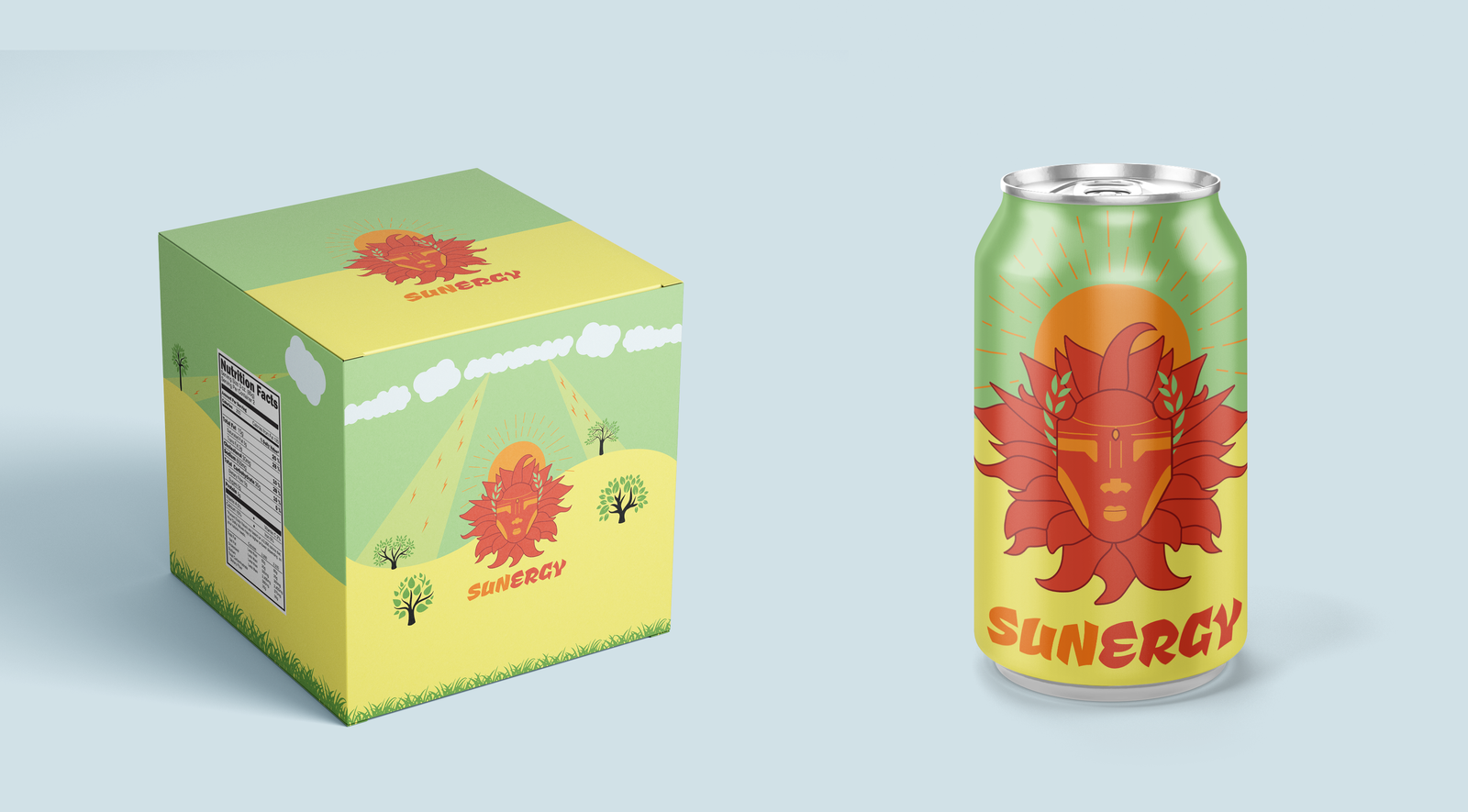
I have designed the energy drink can as well as a packaging 6 pack and a label design, it is a unique idea so it required a unique design, I have used elements from the Greek god Apollo, who is the god of the sun in their mythology, strong and powerful but also compassionate, bringing to the world the power of the sun is his goal, and that is also Sunergy’s goal.
About the Logo
To represent the goal of Sunergy I decided to go to the past and make it modern, to enjoy what both world have to offer.
The character in the logo is Apollo, the Greek god of the sun, the legend says he sets up the sun each morning with his chariot with horses which their hair is a blazing fire and sets it to sleep each day, that energy and strength is what i wanted the people who looked at the logo feel.
I based my design on a drawing of the god and made it more modern in its colors and shapes.
Color pallete
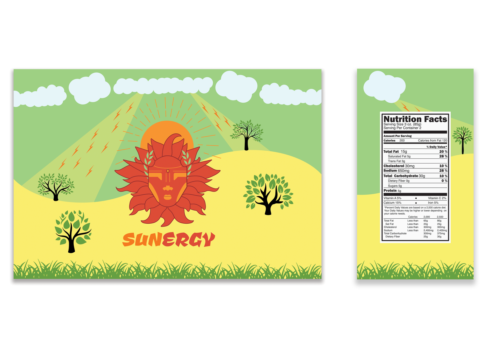
Label and packaging designs
About the package and label design
With my original goal in mind, to represent graphically the power of nature and the sun in particular, I have designed both the label and the packaging to stay true to the original plan.
And so, in my design the original energy is preserved, with some added depth to show and to let the viewers admire the power and simplicity of the background which contrasted well with the drawing of Apollo in the center.